Google has announced changes to its logo for the first time since 2014. The company released the new logo last week, with plans to roll it out to all users soon.
“Some of you might have noticed a new icon in Chrome’s Canary update today. Yes! we’re refreshing Chrome’s brand icons for the first time in 8 years. The new icons will start to appear across your devices soon.” a Google Chrome designer going by the name Elvin announced on Twitter.
Some of you might have noticed a new icon in Chrome’s Canary update today. Yes! we’re refreshing Chrome’s brand icons for the first time in 8 years. The new icons will start to appear across your devices soon. pic.twitter.com/aaaRRzFLI1
— Elvin 🌈 (@elvin_not_11) February 4, 2022
Read: Google Adds Tab-grouping Feature to Chrome
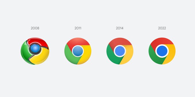
The changes on the new logo appear quite subtle. However, what is quite visible is the lack of shadows on the borders between colours, making them appear a little raised. The red,yellow and green now appear flat while the blue in the middle now looks bigger. The colours also appear sharper in contrast with the previous logo.
The logo is not expected to be the same across all platforms. ChromeOS will feature a more colourful logo that matches its system icons, while on MacOS the logo appears as though its bursting out of the dock. On the other hand, the Windows 10 and 11 versions feature a more dramatic outlook that complements the aesthetic of the other icons.
Email your news TIPS to Editor@kahawatungu.com or WhatsApp +254707482874. You can also find us on Telegram through www.t.me/kahawatungu
Email your news TIPS to Editor@Kahawatungu.com — this is our only official communication channel