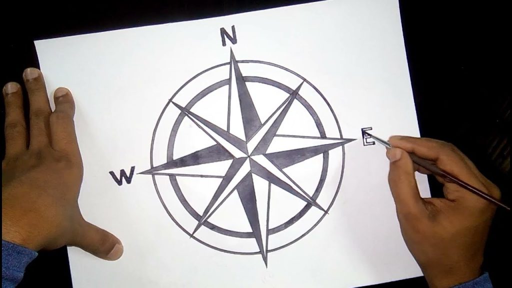
A compass is a simple but attractive object to draw because of its clean lines, circular shape, and clear directional points. Whether you are adding it to a map illustration or practising basic geometric drawing, a compass offers the perfect balance of precision and creativity. With a steady approach and careful observation, you can capture its structure and make it look realistic, balanced, and neat. The process becomes easier when you break it down into clear stages, starting with simple shapes and then adding the finer markings.
- Understanding the Compass Shape
A compass is mostly made up of circles and straight lines, which means the drawing begins with basic geometry. Before you start, visualise a perfect circle and imagine the central point where the needle will sit. This helps you understand the structure and prepares you to place each element correctly.
- Drawing the Outer Circle
Begin by drawing a neat circle, which forms the outer frame of the compass. You can use a round object or draw it freehand, depending on your style. Make the lines smooth because the accuracy of this circle influences how balanced the final drawing will look. This circle represents the casing that protects the internal compass parts.
- Adding the Inner Ring
Inside the main circle, draw a slightly smaller circle to create a border. This inner ring helps separate the compass face from the outer frame. Keep the spacing even all around to make the design symmetrical. This small detail forms the foundation for the markings you will add later.
- Marking the Cardinal Directions
At the centre, draw a small dot. From this dot, draw a vertical line and a horizontal line that cross perfectly in the middle. These lines divide the compass into four sections. Label the top point N for north, the right point E for east, the bottom point S for south, and the left point W for west. These cardinal points give the compass its functional look.
- Drawing the Compass Needle
The needle is the most recognisable part of a compass. Draw a long, thin diamond shape stretching from north to south. The top half, pointing to north, can be coloured or shaded lightly to distinguish it. The bottom half points to south and usually stays unshaded. Keep the needle centred so it aligns properly with the cardinal directions.
- Adding the Secondary Directions
Between the main directional letters, add smaller lines for northeast, southeast, southwest, and northwest. These do not need to be long; they should simply sit between the main dividers. This makes the compass look complete and more accurate, especially if you plan to use it in an illustration.
- Refining Details and Adding Shading
At this stage, go over your lines to clean up the drawing. Add gentle shading around the outer frame to give the compass depth. You can also shade one side of the needle to make it stand out. If you want a more decorative look, add small ticks around the inner ring to represent degree markings. These finishing touches give the compass a polished and realistic appearance.
Also Read: How To Delete Incognito History
Email your news TIPS to Editor@Kahawatungu.com — this is our only official communication channel


