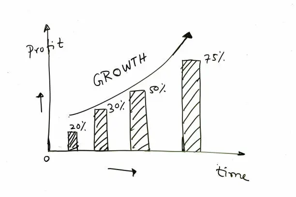
Drawing a graph is a useful skill in both academic and practical settings. Whether you’re presenting data for school, analyzing results, or trying to visualize a trend, a well-drawn graph helps make information clear and easy to understand. This guide will show you how to draw a simple line graph by hand using a ruler, pencil, and paper. Here is how to draw a graph.
Step 1: Draw the Axes
Begin by drawing a large “L” shape. The vertical line is called the y-axis and the horizontal line is the x-axis. These lines represent the framework of your graph. Use a ruler to keep them straight, and place them near the left and bottom edges of your paper to leave enough space for labels and data points.
Step 2: Label the Axes
Next, decide what your graph will show. Write the name of what each axis represents. For example, if you’re plotting temperature over days, label the x-axis as “Days” and the y-axis as “Temperature (°C).” Use neat, clear writing so others can read the labels easily.
Step 3: Mark the Scale
Choose a suitable scale for each axis based on the data you want to plot. Mark equal intervals along both the x-axis and y-axis using small lines and numbers. For example, the x-axis might be marked as 1, 2, 3, 4, and so on, while the y-axis could be 10, 20, 30, etc. Make sure the spacing is even and easy to follow.
Step 4: Plot the Data Points
Take each data value and find where it fits on the graph. Start with the first pair of numbers (for example, Day 1 and Temperature 25°C), and place a small dot where the two values meet on the graph. Continue plotting each pair of data points.
Step 5: Connect the Points
Once all the points are plotted, use a ruler to connect them in order with straight lines. This creates the line graph and shows how the values change over time or across categories.
Step 6: Add a Title and Key (if needed)
At the top of your graph, write a title that clearly explains what the graph is about, such as “Daily Temperature Over One Week.” If your graph includes more than one line or data set, include a key or legend to show which line represents which data.
Also Read: How To Draw A Bat
Email your news TIPS to Editor@Kahawatungu.com — this is our only official communication channel


